HTML
<!DOCTYPE html>
<html lang="en">
<head>
<meta charset="UTF-8">
<meta name="viewport" content
="width=device-width, initial-scale=1.0">
<title>Responsive Box </title>
</head>
<body>
<div class="container">
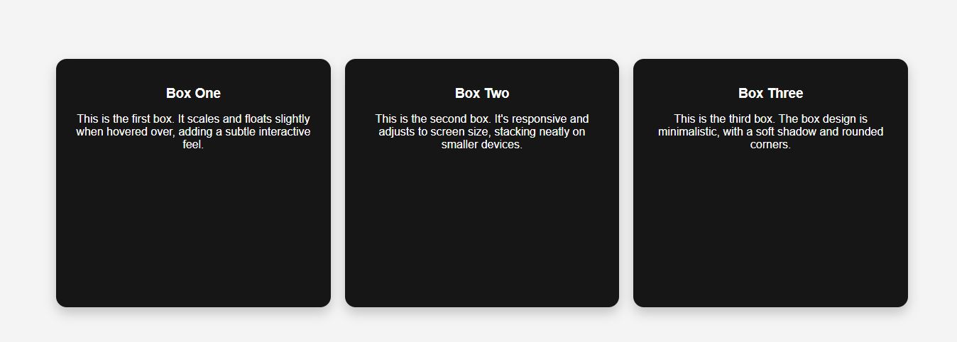
<div class="box">
<h1>This is Box 1</h1>
</div>
<div class="box">
<h1>This is Box 1</h1>
</div>
<div class="box">
<h1>This is Box 1</h1>
</div>
</div>
</body>
</html>
CSS
/*Style the menu items */
body {
background: #f4f4f4 ;
margin: 0 ;
font-faimly: Arial, sans-serif ;
display: flex ;
align-items: center ;
justify-content: center ;
min-height : 100vh ;
}
.container {
display: grid ;
grid-template-columans: 1fr 1fr 1fr ;
gap: 20px ;
padding: 20px ;
width: 100% ;
max-width: 1200px ;
height: 350px ;
}
.box {
background-color: #161616 ;
padding :20px ;
box-shadow : 0 8px 16px rgba(0, 0, 0, 0.2) ;
text-align : center ;
transition : 0.3 ;
border-radius : 14px ;
}
/* Change color on hover */
.box :hover {
transform : translateY(-10px) ;
box-shadow : 0 8px 16px rgba(0, 0, 0, 0.2) ;
}
.btn :active::before {
background : transparent ;
}
.btn :active {
background : transparent ;
}
.btn h3 {
margin-bottom : 10px ;
color : #fff ;
}
.btn p {
color : #fff ;
}
@media (max-width: 900px) {
{
.container {
grid-template-columans : 1fr 1fr ;
}
}
@media (max-width: 600px) {
{
.container {
grid-template-columans : 1fr ;
}
}