How to create responsive web page with a menu bar and sidebar ..?

Creating a Responsive Web Page with a Menu Bar and Sidebar

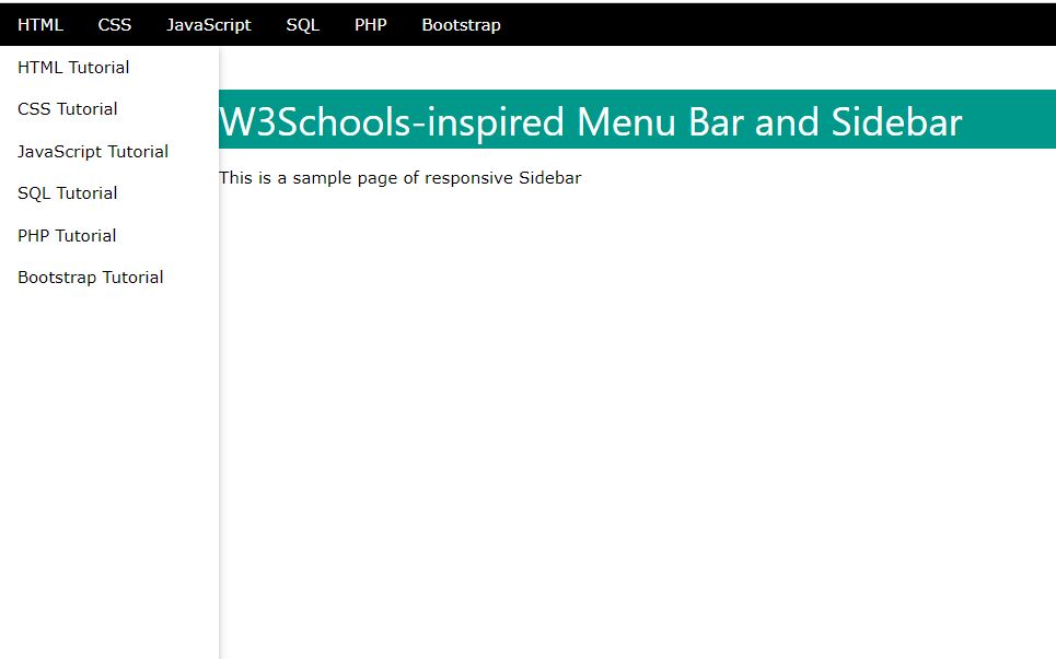
This webpage explains how to create a responsive web page with a menu bar and sidebar using HTML, CSS, and JavaScript. The provided code uses the W3.CSS framework for styling and includes custom CSS for additional design and responsiveness.

Key Points

  1. HTML Structure

  2. Basic Styling and Responsiveness

  3. Interactivity


  1. HTML Elements

  2. <nav class="w3-bar w3-black"> :

    • Menu Bar : Provides navigation links styled with W3.CSS classes for appearance and spacing.

    <div class="w3-sidebar w3-bar-block w3-collapse w3-card w3-animate-left" id="mySidebar"> :

    • Sidebar : Contains links to tutorials and a close button. Styled to animate and collapse.

    <div class="w3-main" style="margin-left: 200px;"> :

    • Main Content : Positioned to the right of the sidebar, adjusting margin to accommodate the sidebar width.

  3. CSS Styling

  4. Media Queries :

    • Adjust Layout : On screens 992px wide or narrower, hides the sidebar and adjusts padding and margins.

    Hover Effect :

    • w3-bar-item:hover : Changes the background color of menu items on hover to provide visual feedback.

    Other Beautiful Navebar

  5. JavaScript Functions

  6. openSidebar() :

    • Show Sidebar : Sets the display property of the sidebar to block, making it visible.

    closeSidebar() :

    • Hide Sidebar : Sets the display property of the sidebar to none, hiding it.

Output


output15
HTML
<!DOCTYPE html>
  <!-- Coding BrodSchool -- >
  <html lang="en">
    <head>
      <meta charset="UTF-8">
        <meta name="viewport" content ="width=device-width, initial-scale=1.0">
        <title>W3Schools-inspired Menu Bar and Sidebar </title>
          <link rel="stylesheet" href="https://www.w3schools.com/w3css/4/w3.css"/>
    </head>
  <body>
  <!-- Menu Bar -- >
       <div class="w3-bar w3-black">
            <a href="#"class="w3-bar-item w3-button">HTML</a>
            <a href="#"class="w3-bar-item w3-button">CSS</a>
            <a href="#"class="w3-bar-item w3-button">Javascript</a>
            <a href="#"class="w3-bar-item w3-button">SQL</a>
            <a href="#"class="w3-bar-item w3-button">PHP</a>
            <a href="#"class="w3-bar-item w3-button">Bootstrap</a>
       </div>

  <!-- sidebar -- >
       <div class="w3-sidebar w3-bar-block w3-collapse w3-card w3-animate-left"style="width: 200px;"id="mySidebar">
            <button class="w3-bar-item w3-button w3-large w3-hide-large"onclick="closeSidebar()">Close ×</button>
            <a href="#"class="w3-bar-item w3-button">HTML Tutorial</a>
            <a href="#"class="w3-bar-item w3-button">CSS Tutorial</a>
            <a href="#"class="w3-bar-item w3-button">Javascript Tutorial</a>
            <a href="#"class="w3-bar-item w3-button">SQL Tutorial</a>
            <a href="#"class="w3-bar-item w3-button">PHP Tutorial</a>
            <a href="#"class="w3-bar-item w3-button">Bootstrap Tutorial</a>
       </div>
         <h1>Welcome to our Website </h1>
          <p style="margin-left: 200px ; margin-top: 40px ;">This is a sample page of responsive Sidebar</p>
   </body>
  </html>
CSS
/*Hide main content on small screens*/
   @media screen and (max-width: 992px) {
   .w3-main {
margin-left: 0 !important;
   }
/*Show sidebar on small screens */
   .w3-sidebar.w3-collapse {
   display: none;
    }
   .w3-main.w3-collapse {
   margin-left: 0 ;
   }
/*Add padding to sidebar button on small screens */
   .w3-hide-large {
   padding 8px 16px: !important;
   position: absolute;
   top: 0px ;
   right: 0px;
   }
  }
/* Change color on hover */
   .menu li a: hover {
   background-color: #575757;
}
Javascript
/*JavaScript*/
   
<script>
     function openSidebar() {
      document.getElementById("mySidebar").style.display ="block";
    }
     function closeSidebar() {
      document.getElementById("mySidebar").style.display ="none";
    }
    </script>


BrodSchool

Jagatpur,
Raebareli 229402, UP,  India
Amresh Kumar (Founder)
Phone: +91 9198 26 3500
Email: suportucracker@gmail.com

Usefull link

Home
About
Contact us
Privacy Policy
Term and Condition

Quick Link

HTML & CSS
JavaScript
Project
Others