Creating a Responsive Login Form & Registration form
Hello friend, I hope you are doing great. Today you will learn how to create an Responsive Login Registration Form using HTML CSS and Javascript.
The interesting thing about this form is that when the user enters
When you click on signup, it automatically changes to the same form. And when you open it on any device, it automatically adjusts.
Basic Style
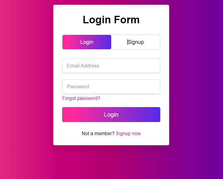
- Shape : The shape of this box is a slightly rounded rectangle, giving it a soft and modern look.
- Color : This button uses Multi backgroun color .
Output
Other
HTML
<!DOCTYPE html>
<html lang="en">
<head>
<meta charset="UTF-8">
<meta name="viewport" content
="width=device-width, initial-scale=1.0">
<title> Login & Signup Form </title>
</head>
<body>
<div class="container">
<div class="login form">Login Form</div>
<div class="title signup">Signup Form</div>
</div>
<div class="form-container">
<div class="slide-container">
<input type="radio"name="slide"id="login" checked>
<input type="radio"name="slide"id="signup" >
<label for="login"class="slide login">Login</label>
<label for="login"class="Signup">Signup</label>
<div class="slider-tab"></div>
</div>
<div class="form-inner">
<form action="#"class="login">
<div class="field">
<input type="text"placeholder="Enter your email">
</div>
<div class="field">
<input type="text"placeholder="Password">
</div>
<div class="pass-link"><a href="#">Forgot password ?</a></div>
<div class="field btn">
<div class="btn-layer"></div>
<input type="button"class="button"value="Login">
</form>
<div class="signup">
<div class="signup">Not a Member ?</a>
<a href="#">Signup Now</a>
</div>
</div>
</div>
</body>
</html>
CSS
/*Style the box items */
* {
padding: 0 ;
margin: 0 ;
box-sizing: border-box ;
font-family: sans-serif ;
}
body {
backgroun-color: #6433f9 ;
min-height: 100% ;
width: 100% ;
display: grid ;
}
.container {
background-color: #fff ;
padding :30px ;
overflow :hidden ;
max-width :352px ;
box-shadow : 0 15px 20px rgba(0, 0, 0, 0.4) ;
border-radius : 7px ;
}
.container .title {
width :50% ;
font-size :35px ;
text-align :center ;
font-weight :600 ;
transition :all 0.6s ;
}
.container .slide-controls {
width :100% ;
position :relative ;
display :flex ;
overflow :hidden ;
height :50px ;
margin :30px 0 10px 0 ;
line-height :48px ;
cursor :pointer ;
text-align :center ;
border-radius : 5px ;
}
.card-item h2 {
color :#000 ;
font-size :18px ;
margin-top :27px ;
font-weight :600 ;
}
.slide-controls .slide {
font-size :18px ;
align-items :center ;
justify-content :center ;
height :100% ;
weight :100% ;
color :#fff ;
transition :all 0.6s ease ;
z-index :1 ;
line-height :45px ;
border-radius :50% ;
}
.slide-controls .slider-tab {
position : absolute ;
height : 100% ;
weight : 50% ;
background-color : #009579 ;
left : 0px ;
z-index : 0 ;
border-radius : 5px ;
backgroun : blue ;
transition : all 0.6s ;
}
.form .btn {
height : 50px ;
overflow : hidden ;
width : 100% ;
position : relative ;
border-radius : 5px ;
}
form .btn .btn-layer {
height : 100% ;
overflow : hidden ;
width : 100% ;
font-weight : 500 ;
cursor : pointer ;
position : relative ;
color : #fff ;
z-index : 1 ;
border : none ;
}
Javascript
/*JavaScript*/
<script>
const logintxt=document.querySelector('.title-text .login')
const loginform=document.querySelector('.form.login')
const loginbtn=document.querySelector('.label.login')
const signupbtn=document.querySelector('.label.signup')
signupbtn.onclick= ( ()=>{
loginform.style.marginLeft="-50%";
logintext.style.marginLeft="-50%";
}) ;
loginbtn.onclick= ( ()=>{
loginform.style.marginLeft="0";
logintext.style.marginLeft="0";
}) ;
signuplink.onclick= ( ()=>{
signupbtn.click();
return false;;
}) ;
</script>